Environment: 1.5 degrees of warming in 10 years
November 26, 2023
Not long ago it looked like we’d exceed 1.5oC in 20 years, now it looks like 10. Maybe sooner if politicians keep approving new fossil fuel mines and fields and the logging of native forests. Particulate air pollution kills 9 million a year.
When will we hit 1.5oC of warming?
Because people know I have an interest in climate change, I am asked ‘Are the scientists’ previous predictions about global warming coming true?’. My usual answer is ‘Yes, they are except that the serious events they predicted are happening earlier than they predicted.’
This is illustrated in the online interactive version of the graph below.
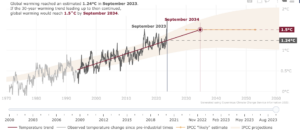
The graph displays two measures of global warming:
- the grey and then black zig zag line shows for each month from January 1971 to September 2023, the average amount of warming compared with the average temperature for 1850-1900, and
- the straight red line shows the 30-year trend of warming from 1993-2023 and an extension of the trend that projects when warming will hit 1.5o
As you can see, the projection in September 2023 was that global warming will reach 1.5oC in September 2034. But even more concerning is that by using the ‘slider’ at the bottom of the online graph you can see how the projected date of arrival at our 1.5oC destiny has changed over the last 23 years. I have summarised this in the table below.
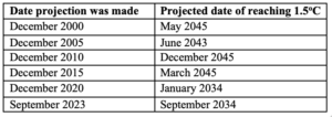
In summary, the predicted 1.5oC date hovered around the early and mid 2040s until December 2016, after which it has been moving progressively earlier. Since December 2020, the projection has been sometime during 2034 or 2035.
The advance of about a decade from the mid-2040s to the mid-2030s has, of course, been due to global warming increasing more rapidly in recent years than had been expected.
Fossil Fuel Production Gap + Hypocrisy = Politicians Credibility Gap 510
In the lead up to the Dubai COP meeting that starts in a few days, the UN Environment Program has updated its Production Gap Report. The report puts numbers to the chasm between the amount of coal, oil and gas we can burn to keep global warming under 1.5oC (to be precise, it’s not a guarantee, it’s only a 1 in 2 chance of staying under 1.5) and the amount of coal, oil and gas that governments around the world are planning to produce between now and 2050. The report also looks at keeping warming under 2oC but I’ll focus on 1.5.
The diagram below displays the amount of greenhouse gas (GHG) produced each year by fossil fuels – it paints an ugly, though not surprising, picture.
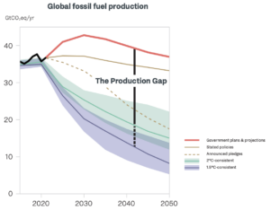
Focus on the top red line and the bottom purple line. The first point to note is that the GHGs produced by fossil fuels in 2050 will be about the same as today, having been even higher in the interval. So much for any hope of phasing down fossil fuels, and completely forget phasing them out.
Because staying under 1.5oC requires the world to rapidly reduce its use of fossil fuels (and hence reduce their emissions), the Production Gap between what’s needed (purple line) and the planned production (red line) gets wider and wider. By 2050 we’ll be producing three and a half times as much fossil fuels as we should be for the environment and humanity to be somewhat safe. As the report says, ‘Continued production and use of coal, oil and gas are not compatible with a safe and livable future’.
Looking separately at governments’ production plans for each of the three fossil fuels, globally coal production will have fallen by only a third by 2050 and the production of oil and gas will both have increased by about a third.
This is where the Credibility Gap makes its appearance. Basically, the politicians (well, most of them) are a bunch of hypocrites. They know there’s a problem, they’ve said they’re going to do something about it (not enough but it’s a start), but they are acting to make the problem worse.
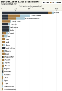
There are approximately 200 countries in the world but just twenty of them account for 82% of fossil fuel production and 73% of consumption. Most of the twenty are planning to increase their levels of production until at least 2030. The major production-increasers are India (coal), Russia (coal, oil and gas), USA (oil and gas), Saudi Arabia (oil) and Brazil (oil).
Australia, one of the culpable twenty, has plans to marginally increase the production of coal and gas between 2021 and 2030. We have a target of net-zero emissions by 2050, of course, but that’s domestic emissions and as we export most of our coal and gas, there’s absolutely nothing for us to worry about there! Our coal and gas may be counted in someone else’s emissions but the Earth’s natural systems don’t consider who produces it or burns it, everyone everywhere suffers the problems, albeit some more than others.
The graph below presents national greenhouse gas (GHG) emissions in a somewhat unusual way. Most commonly, national GHG emissions are attributed to the country where the fossil fuels are burnt. The graph below shows where they were produced in 2021. I’m sure you don’t need me to help you analyse it.
Missed opportunities to tackle air pollution
Air pollution of the traditional kind (particulate matter, oxides of sulphur and nitrogen and heavy metals) arising from the burning of fossil fuels is a major cause of serious illness and death worldwide. Apart from reducing greenhouse gas emissions, phasing out fossil fuels cleans up the air we breathe and reduces cardiovascular and respiratory diseases, including lung cancer. A recent study indicates that just the fine particulate matter (PM2.5) part of the pollution produced by the burning of fossil fuels causes almost 9 million premature deaths annually worldwide. Unborn babies and children under 5 years are particularly vulnerable.
Signatories to the Paris Agreement are required to submit their national targets and plans for helping to keep global warming under 2oC – these plans are known as Nationally Determined Contributions or NDCs. Disappointingly, most countries are failing to identify in their NDCs the immediately cleaner air and better health that will accompany the elimination of fossil fuel use.
The attention given to air pollution, its harmful health effects and action to reduce it were assessed on a fifteen-point scale in the most recently submitted NDCs of 170 countries. Only 15 countries, mostly low and middle income, achieved more than 7.5/15. High-income countries, the top ten per capita greenhouse gas emitters (this group includes Australia), the top ten total emitters, and the ten countries with the highest rates of air pollution all scored averages of 2.5-2.9/15. Less than a third of countries’ NDCs made any reference to the health impacts of air pollution.
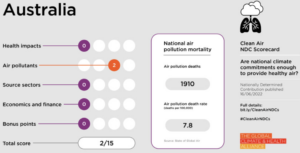
Australia scored a dismal 2/15, including a 0/3 in the health section. It got its only 2 points for naming some air pollutants but failed to make any links between climate change, air pollution and health, links that could increase support for reducing our fossil fuel production, export and use. One might almost think that the Albanese government doesn’t want the public to make those links.
Forest loss continues
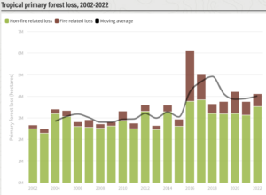
In 2022, 4.1 million hectares of tropical forest were lost. This is the equivalent of losing 11 football fields of forest per day? No; per hour? No; per minute! About 90% was lost to logging, clearing and natural causes and 10% to fire. Over the last 20 years, tropical forest loss has increased from around 3 million hectares per year to around 4 million (half of Tasmania).
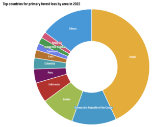
Brazil is the runaway leader when it comes to the loss of primary forest in the tropics but the Democratic Republic of the Congo and Bolivia are significant contributors to this shameful record.
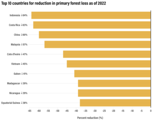
On the other hand, several countries made a big effort and reduced their loss of primary forest between 2015-17 and 2020-22 by around 50%
Just for comparison, the rate of tree loss in Russia since the early 2000s has roughly doubled but this has been mainly due to fires.
In a further complication to the story, tree cover alone does not tell the whole story. Europe has managed a 1% increase in tree cover over the last two decades but the area covered by tall forests (trees over 15 metres) decreased, largely due to logging, fires and pests, by 3% – an area about a quarter of Tasmania. While the tall trees are often replaced by new plantings, ecosystems are severely damaged (e.g., loss of soil health, biodiversity and safe refuges, and disruption of water drainage), and it takes decades and centuries for young trees and the soil to store large quantities of carbon again.
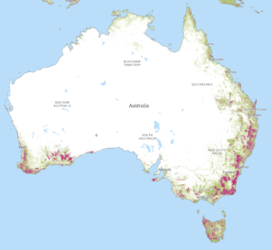
Australia is far from innocent in the forest destruction. In the map below, the green shows areas of tree cover with at least 25% canopy density in 2010 and the purple shows areas that were lost between 2010 and 2022. Tasmania, southwest Western Australia and coastal areas from Bundaberg to Adelaide have suffered greatly.
The tragedy of this for Australia is that state governments continue to authorise the destruction of native forests and their ecosystems even though the industry is rapidly declining ( graph below).
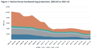
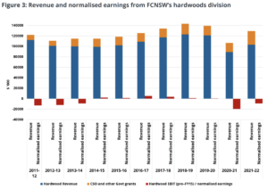
Wood from native forests has been largely replaced by wood from plantations. The craziest aspect is that even with government subsidies the industry regularly makes a financial loss, clearly demonstrated by the next graph showing the financial results for the state-owned Forestry Corporation of NSW (FCNSW) for the last eleven years. In 2021-22, NSW government grants plus the operating loss totalled about $30 million. The financial results for Victoria and Tasmania are similar.
It’s difficult to know which is worse: throwing good public money after bad or wantonly destroying the environment for no good purpose.
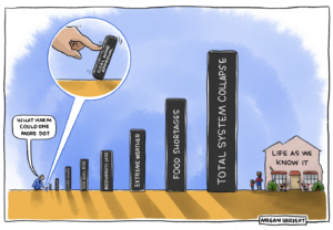
Climate dominoes cartoon a winner
Australian cartoonists boycotted the Walkley Awards in August because the awards were sponsored by Ampol. They then established their own Australian Cartoonists Association Stanley Award for the best climate-related cartoon. The winner was Megan Herbert.
Amanda McKenzie, CEO of the Climate Council, who supported the award, said ‘Megan Herbert’s cartoon shows the domino effect of coal mine approvals on our lives and paints a clear and confronting picture for Australians’.