Inequality on steroids: The distribution of economic growth in Australia
April 17, 2023
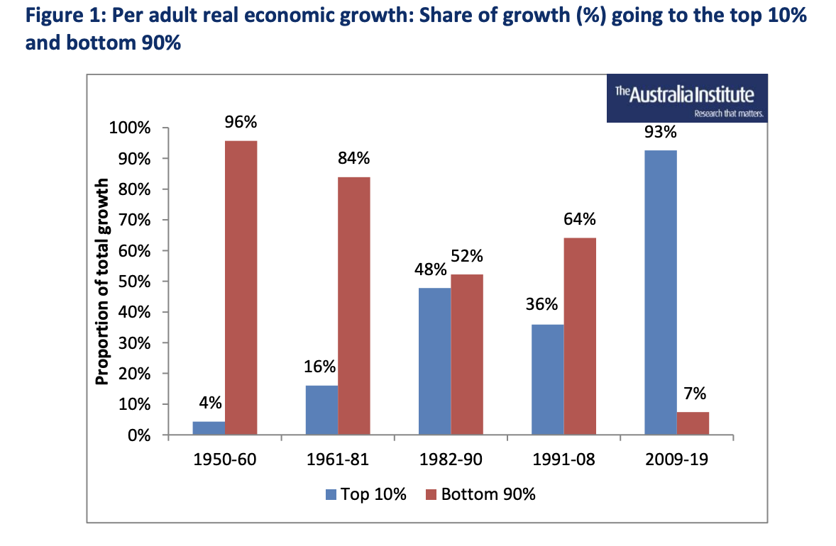
Since the global financial crisis there has been a fundamental change in the operation of the Australian economy. Since World War Two, the majority of the benefits of economic growth have flowed to the bottom 90 per cent of income earners. However, as shown in Figure 1, between 2009 and 2019 the top 10 per cent got almost all of the gains of the latest recovery: that group secured 93 per cent of the income growth in that period.
Conversely, the remaining 90 per cent of Australians received very little of the fruits of the economic expansion. This paper describes the data, method and sources used to create Figure 1, along with their implications.
Introduction
In recent years, there has been significant discussion in Australia about the distribution of income and wealth. The Australia Institute has contributed to those discussions. Generally the results have shown that the distributions of income and wealth have grown more unequal in recent decades. (To date most of the work on inequality has used data derived from the national accounts or similar ABS series. However, these measures typically exclude capital gains. When included in the analysis, the impact of capital gains worsens the income distribution in Australia very significantly.) However, some have argued that the worsening inequality in Australia has not been significant. Others would suggest inequality is not something we should worry about as it may simply mean that people are receiving their just rewards with their just rewards being the value of their input into production. On that reasoning the market sets the rewards for peoples contributions to production and the income distribution reflects those contributions to production.
Australians are often told that productivity and economic growth are essential to rising living standards and, in turn, that we need to implement policies that promote higher productivity and economic growth. The implicit assumption is that all benefit from higher economic growth which will be fairly distributed. But this is not necessarily truethe benefits from the mining boom, for example, were not evenly distributed. Hence it is important to monitor exactly how the growth in the economy is being distributed.
The International Monetary Fund (IMF)s 2021 global survey provides overwhelming evidence that worsening inequality is bad in itself, as well as being associated with poorer economic performanceand that inequality is indeed getting worse. This paper seeks to analyse how the fruits of economic growth have been distributed between the majority of Australians (the bottom 90 per cent of income earners) on the one hand and the top 10 per cent on the other.
The analysis in this paper seeks to examine the distribution of the gains from economic growth in Australia over most of the post war period, that is from 1950 to 2019. A related issue is whether the distribution of the gains from economic growth are being distributed any differently over the course of this period. To undertake the analysis, it was decided to break the post war period into a number of subperiods and for that we chose the periods traced out by five major economic crises or Australian recessions that punctuated the post war period and so defined five expansion periods.
Data and analysis
The data used in this analysis comes from the World Inequality Database (WID), which was developed by some of the leading international researchers on inequality, including Thomas Piketty.
The WID provides real national incomes by calendar year These incomes are presented as per adult values, rather than per capita, and are expressed in Euros (using purchasing power parity adjustments, used to adjust different currencies for their different purchasing power over a standard basket of commodities). Using a per adult measure is desirable as it abstracts from the effects of population growth.
As shown in Figure 2 below, the WID database reports that Australias national income grew from 14,682 per adult in 1950 to 40,186 per adult in 2019.
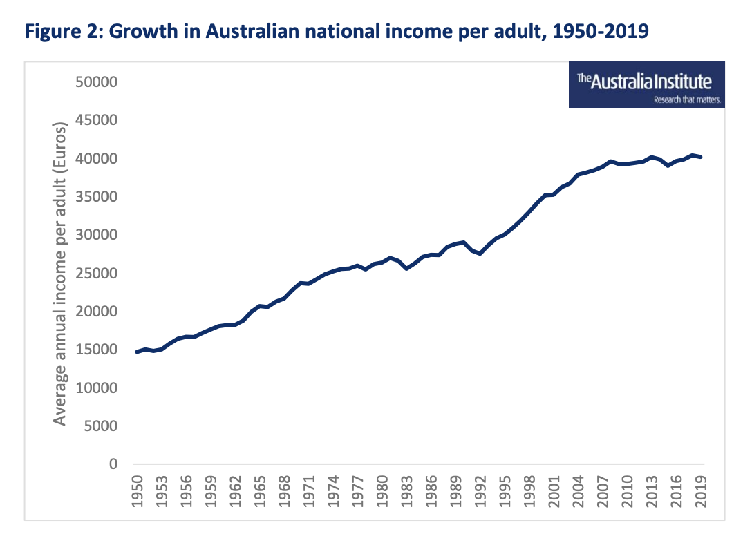
The WID also gives data for the share of incomes going to the top 10 per cent of income recipients. Figure 3 below graphs the percentage of national income accruing to the top 10 per cent of income recipients in Australia in each year between 1950 and 2019.
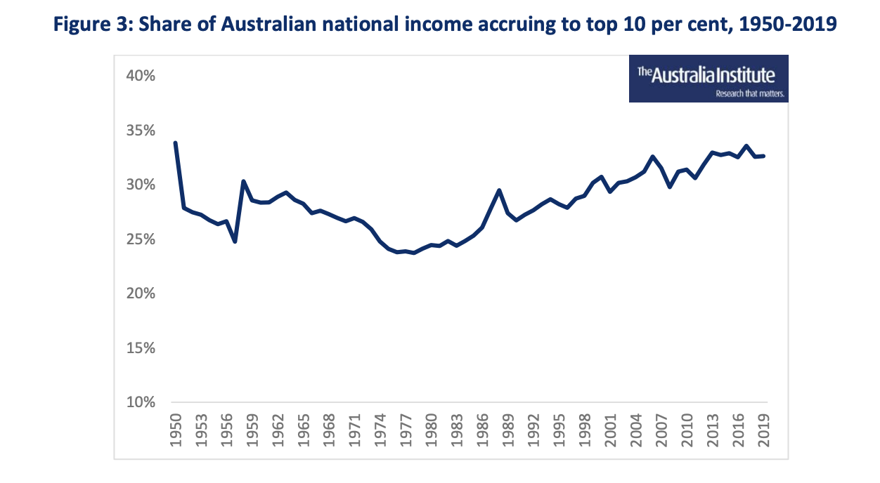
The share of national income accruing to the top 10 per cent started to fall in 1950 and remained in decline until the late 1970s which means that income was becoming distributed more evenly over the course of this period. The trend reversed in the late 1970s, and income has become distributed less and less evenly in the decades since.
Expansion periods
This analysis breaks the growth of the Australian economy from 1950 to 2019 into five expansion periods. Each period starts with a recession or economic crisis and ends right before another recession or economic crisis. Economists refer to this movement of an economyfrom recession to boom time and back to recessionas a business cycle. By starting our expansion periods with a recession and ending on the eve of the next, we ensure that each period has all the elements of a cycle.
The five expansion periods are described below.
1950 to 1960 The first period begins in 1950enough time to be clear of the distorting effects of the Second World Warand ends in 1960, on the eve of the Menzies Government credit squeeze that produced the 1961 recession. (1950 also represents the beginning of the ABS national accounts data series that continues to this day). Over this period, the gains from economic growth were enjoyed by the overwhelming majority of the Australian people: 96 per cent of the per adult real economic growth went to the bottom 90 per cent, while four per cent went to the top 10 per cent.
1961 to 1981 The second period begins with the 1961 recession and ends just before Australias longest post-war recession, which began in 1981 and extended through to 1983. During this period of economic growth there were several minor downturns in 1971, 1975 and 1977. Over this period the gains from growth were spread fairly evenly, with 84 per cent going to the bottom 90 per cent and 16 per cent going to the top 10 per cent. The proportion going to the bottom 90% is lower than in the first period, but is still significant.
1982 to 1990 The third period begins with the 1982-83 recession, and then includes a rapid period of growth through the remainder of the 1980s, and ends in 1990 right before the 1991 recession. This period saw a substantial increase in the gains from growth that went to the top 10 per cent. They received 48 per cent of the per adult growth, leaving only 52 per cent for the remaining 90 per cent.
1991 to 2008 The fourth period begins with the 1991 recession. This recession saw a substantial and sustained increase in the unemployment rate, which took about a decade to return to pre-recession levels. After the recession there was a slow recovery, which was followed by a downturn in the year 2000 and then a boom period in the early and mid- 2000s. This period ends on the eve of the Global Financial Crisis (GFC) in 2008. The distribution of growth in this period was more even than in its immediate predecessor, but far less even than in the two earlier ones: 64 per cent of per adult real economic growth went to the bottom 90 per cent and 36 per cent go to the top 10 per cent.
2009 to 2019 The fifth and final period starts with the GFC, which saw many of the worlds economies fall into recession. While the Australian economy avoided a technical recession (defined as two consecutive quarters of negative economic growth), economic growth slowed significantly, and unemployment increased by about two per cent. This was followed by a relatively fast recovery, which lasted until 2012, at which point the economy started to stagnate. This stagnation lasted from 2013 until 2019 and was characterised by below-average economic growth and low wage growth. The period finishes on the eve of the COVID-19 pandemic and its associated recessionthe data after 2019 is likely to be difficult to interpret given the impact of the pandemic. In this fifth and final period, the overwhelming share of gains from growth went to the top 10 per cent: they received 93 per cent of the per adult real economic growth. The bottom 90 per cent received just seven per cent.
Presenting the data
By combining changes in real national income per adult with the share of national income going to the top 10 per cent, we can calculate how the growth in national income has been distributed. For example, if Gross Domestic Product (GDP) increased by 10 per cent over a given period, and the share of GDP going to the top 10 per cent increased by five percentage points over the same period, from 20 to 25 per cent of GDP, then we can say that the top 10 per cent received three quarters of the increase in GDP.
Working through an example, the WID estimates Australias national income at 14,682 per adult in 1950 and 18,038 in 1960. This is an increase of 23 per cent. The top 10 per cents share of national income declined from 34 per cent to 28 per cent over the same period. This means that four per cent of the economic growth went to the top 10 per cent and the remaining 96 per cent of national income growth went to the bottom 90 per cent. We use this approach in Figure 4 which shows the share of economic growth going to the top 10 per cent and bottom 90 per cent for each of the five expansion periods.
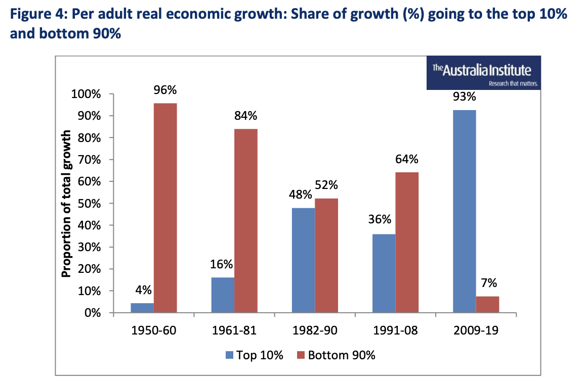
The results reported in Figure 4 are alarming. In the most recent expansion shown, there has been a complete change from earlier periods where the bottom 90 per cent did indeed share in the benefits when the economy expanded and the resultant higher per adult incomes. The 2009-19 expansion was associated with a large increase in the share going to the top 10 per cent and very little for the bottom 90 per cent. The contrast between the first period and the final period is striking: the results are almost completely reversed. The first expansion period saw almost all the gains going to the bottom 90 per cent while the final period saw almost all the gains going to the top 10 per cent.
WID figures show that over the period 2009-19, the share of the top 10 per cent of income recipients increased from 31.2 to 32.6 per cent of national income, which had the effect of giving almost the whole of the 2009-19 expansion to the top 10 per cent. Figure 4 shows that such an outcome has not been the norm over Australias post-war history. In all of the previous expansions, the bottom 90 per cent received at least 50 per cent of the economic growth, measured on a per adult basis. While the distribution of the latest expansion is unique, the data does show that there has been a post-war trend towards the top 10 per cent capturing a higher share of the benefits of successive expansions.
International comparisons
As Figure 5 shows, the share of the post-GFC economic growth that went to the top 10% is far higher in Australia than in other developed countries. The calculations used in Figure 5 are based on the same data source as used for Figure 4, but start from 2010 instead of 2009. This is because the GFC had a bigger impact on some economies than othersAustralia, for example, did not fall into recession, while many of the other economies did. To overcome this potential bias, we have shifted the start point forward, as by 2010, everyone in Figure 5 was out of recession.
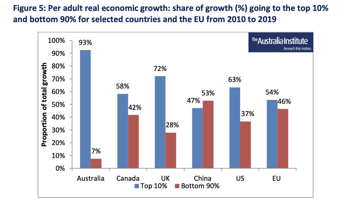
Figure 5: Per adult real economic growth: share of growth (%) going to the top 10% and bottom 90% for selected countries and the EU from 2010 to 2019
In every country except China, where gains were split almost evenly between the top 10 per cent and bottom 90 per cent, the majority of the gains from growth went to the top 10 per cent, demonstrating how the income of the top 10 per cent has grown more quickly than that of the rest of the population. Even so, the share going to the top 10 per cent in Australia is strikingly highfar higher than elsewhere. The gains accruing to the Australian bottom 90 per cent are barely perceptible, and most likely that is how the bulk of people in Australia have subjectively experienced the period 2010 to 2019.
Conclusion
Over the post-war period, gradually smaller shares of the fruits of economic growth have been accruing to Australians outside the top 10 per cent of income recipients. By 2009-2019, the period between the end of the GFC and the beginning of the pandemic, the top tenth of income recipients have taken 93 per cent of the economic expansion, almost all of the increase in income per adult. This result seems to be the product of a fairly weak expansion together with a significant redistribution of income towards the top tenth. Of course, these outcomes reflect much deeper forces, such as the concentration of Australian businesses into oligopolies and the weakening of unions in the Australian labour market. They also reflect a worldwide trend: an examination of other economies confirms that the benefits of economic growth are going disproportionately to the top 10 per cent of income recipients.
Our analysis ends on the eve of the pandemic recession, with the Australian economy now experiencing a period of growth, and the beginning of a new expansion period. A crucial question with which Australia will need to grapple is whether the distribution of growth will return to the patterns observed before the pandemic. It is important that all income groups share in future economic growth. The results in this paper naturally raise many questions, not the least of which is how can we get back to an inclusive growth program and, if we dont do that, how long can Australia sustain an economic and social setting which excludes the bulk of its people from sharing in the economic gains?
Original article and report published by the Australia Institute on 11 April, 2023. Republished with permission.
Footnotes in the report have been imbedded into copy and can be found in situ in the original report.
