Simple illustration of how our climate has changed
January 15, 2021
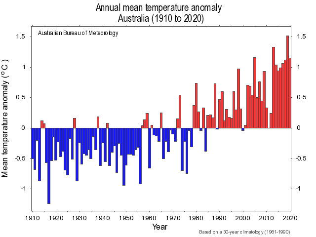
Climate change sceptics and doubters might be beyond persuasion but the Bureau of Meteorology has a plain bar chart that shows how our climate has changed
A year ago, I was living overseas and watching, via live streaming, the catastrophic bushfires that were destroying so much of eastern Australia’s forests, farmlands and even townships. I was saddened, but not surprised, to see in the conservative news media a debate about the part climate change played in the extent and intensity of the fires.
On reflection, it was not so much a debate as a rejection of the notion that climate change played a significant role.
This week I was saddened (but still not surprised) to see that Pearls and Irritations contributor Mike Scrafton found it necessary to write about an article highlighting Australia’s approach of merely slowing the rate of growth of greenhouse gas emissions.
“It is difficult to understand why, in the face of evidence of a growing and very serious threat to the health, well-being, welfare and security of their citizens, Australian governments don’t recognise the urgent need to address adaptation at the integrated national, regional and local levels, and systematically,” he wrote.
Apart from the indelible images of the destruction, two things have stayed in my memory over the past year. One was a simple illustration of Australia’s warming climate, showing how Australia’s climate has already changed. The other was an idea that offered hope.
The illustration was a graph of Australia’s temperature, year by year, that the Australian Bureau of Meteorology publishes on its website. The records are expressed as temperature anomalies – the differences between recorded temperatures and a long-term average baseline (in this case readings from 1961 to 1990).
A positive number indicates a warmer year; a negative one indicates a cooler year.
The value of this graph is that it shows, easily and clearly, the difference between weather and climate. Weather is short-term; climate is longer-term. A common view is 30 years of consistent records to give us climate. One definition I read said climate is what you expect; weather is what you get.
The graph shows that the years 1910 to 1950 were cooler than we are now experiencing, although the trend was interrupted by hotter spells: Australia is a hot country. A warming trend starts to edge up in the 1950s and becomes marked after 1980. In the decades since then, Australia has had only four cooler years and one neutral year.
The warming trend is even clearer after 1990 (30 years ago). In that time, Australia has had only one cooler year (2000) and one neutral year (2011). The warmest year since the bureau consolidated its national records was 2019; last year was the fourth warmest.
These gaps might mean the graph is not 100 per cent mathematically conclusive in establishing that Australia’s climate had already changed. It is doubtful if anything would convince the climate sceptics, doubters and vested interests but the graph is striking - and highly persuasive. Not as compelling as the unstoppable ferocity of the bushfires but convincing nevertheless.
The warming trend over 30 years - and more - is clear.
The source of hope that has remained in my mind was a book by economist Ross Garnaut and called Superpower: Australia’s Low-Carbon Opportunity. Garnaut is a noted economist whom most Pearls and Irritations readers would know, at least by reputation. He has written extensively on the science and economics of climate change. His works include the 2008 report to the prime minister and premiers, the Garnaut Climate Change Review.
Superpower is a dense book but it is well worth reading.
The central idea is that Australia has a chance of establishing a comparative advantage in producing low-cost renewable energy and this could make it a strong industrial nation.
Australia has vast areas of land, particularly around the Bight, where the sun shines often and the wind keeps on blowing, defeating the standard objection to the possibility of large scale solar- and wind- where the sun shines often and the wind keeps on blowing defeating one of the objections to the possibility of large scale solar- and wind-power generation. Australia could become a net-zero emissions country and remain a thriving modern economy.
I reviewed the book on Amazon in early February last year. The title was: At a time of despair, hope.
Anthony Albanese has started using the language of Superpower, a good start as he promises to introduce some new ideas into Australia’s climate change debate at the sharp end of political contest.
Gladys Berejiklian, according to The Guardian, has endorsed the goal of net-zero emissions by 2050. Scott Morrison, however, remains reluctant. Perhaps he is like the late George H.W. Bush – suspicious of the “vision thing.”