Environment: Australia’s exported greenhouse gas emissions are double our domestic emissions
February 23, 2025
Australia is the fourth largest exporter of fossil fuel emissions. The US should be bearing the largest financial responsibility for helping poorer nations cope with climate-related damage. There’s never been a global transition from one energy source to the next.
Who exports fossil fuels and their emissions?
Greenhouse gas (GHG) emissions from fossil fuels are measured in and reported to the UN by the country in which the emissions are released into the atmosphere. If the burnt fuel has been imported, the emissions are still reported by the country in which the coal, oil or gas has been burnt, not the one where it was extracted.
Consequently, although all the nations that have signed the Paris Agreement have committed to reducing their GHG emissions, each country reports only the emissions produced within their borders, not the ones created where the fossil fuels they export are burnt.
The bar charts in the figure below display the top 10 emission exporting countries in 2022. Overall (left hand bar chart), the top 10 countries are responsible for 60% of the world’s total exported emissions, and the top six account for 50%, with the old Cold War warriors in almost a dead heat for gold and Australia just missing out on a bronze.
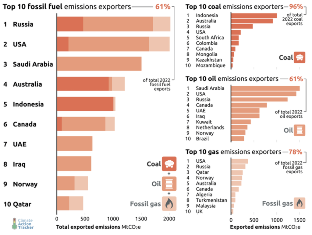
Of the three fuels, oil is clearly the biggest source of exported emissions, with Saudi Arabia, US and Russia at the top. This largely explains their positions at the top of the chart of overall emissions.
For coal, the top 10 countries are responsible for almost 100% of the exported emissions. In fact, Indonesia and Australia between them are responsible for about two-thirds. I must confess that I was somewhat surprised by how few exported emissions are attributable to gas.
The next histogram compares the domestic and exported fossil fuel emissions of the top eight countries. Saudi Arabia, Australia, Canada, UAE and Norway stand out as exporting far more emissions than they emit domestically, although the UAE’s and Norway’s domestic and exported emissions are all relatively small. In contrast, the USA’s exported emissions may be only a third of its domestic emissions but both are huge.
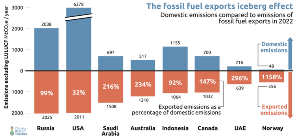
If any of these eight countries is serious about making a real contribution to controlling global warming they need to focus on reducing their exported emissions at least as much as their domestic ones. Regrettably, efforts to reduce exported emissions are dismal for obvious financial and political reasons but the reality is that until the exporting nations, particularly the wealthy industrialised ones, agree to stop exporting fossil fuels, it will be impossible for the world to meet its targets to reduce emissions and limit global warming.
Fundamentally, while nations ignore the polluter pays principle, fossil fuel companies will continue to dig up and export coal, oil and gas, pollute the environment and profit handsomely because they have no obligations under the Paris Agreement and so bear no formal responsibility for reducing emissions.
As a footnote, at the 2023 COP meeting, the nations agreed to “transition away” from fossil fuels. This was a very weak commitment (no targets, no timeline, no responsibilities, no urgency) but more than they’d managed in the previous 30 years. Over the course of the following 12 months, the “parties” (that is, the countries that have formal “party” status at the COP meetings) had plenty of opportunity to reflect on their collective mental aberration and there was no repeat of this out-of-character behaviour at the 2024 COP meeting last November. Who knows if this was in any way related to the activities of the fossil fuel company representatives who are now present in force at all COP meetings, despite the companies not enjoying “party” status.
Which countries should fund climate-related damage repair?
At last year’s COP meeting, the parties did agree to contribute US$300 billion annually by 2035 to fund the catchily named New Collective Quantified Goal or NCQG. The NCQG’s purpose is to finance the repair of the loss and damage caused by climate change in poorer nations.
Problem number 1: US$300 billion is a big improvement on the Paris Agreement’s US$100 billion per year that 23 of the wealthiest countries were responsible for finding but it’s still nowhere near enough.
Problem number 2 is to identify the countries that should contribute to this fund, how much each should contribute and the criteria that should be used to inform these decisions. The World Resources Institute has developed a climate finance calculator to help progress these discussions, discussions that will undoubtedly be difficult if not frankly acrimonious. The calculator uses each country’s total and the per capita historical GHG emissions and current income to estimate their financial responsibility to the NCQG.
It’s possible to use the calculator to test the effects of various assumptions about, for instance, the starting date for historical emissions and the countries that might be expected to contribute. Whichever way you do it, however, one country always comes out as being responsible for contributing the biggest financial share. They have generated the most GHGs historically, they are still the second largest emitter of GHGs annually, they are very rich and they have high average emissions and high average wealth per person. Yes, it’s the US.
For one exemplar scenario developed in the calculator, the bar chart below shows the 20 countries with the most climate finance responsibility and their respective contribution share. The US’ share is 20% and Australia’s 2.35%. Approximately two-thirds of all the nations have a share of less than 0.5%, and a third have a share of less than 0.1%.
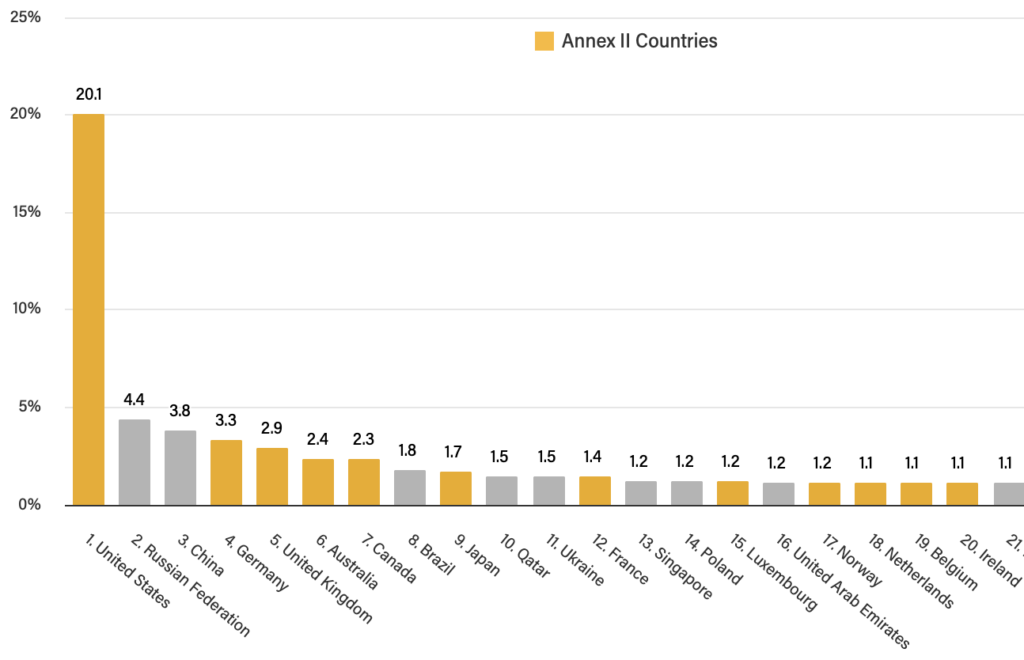
The rankings of the various nations and their respective shares vary according to the criteria selected. However, charts similar to the one above and the chart below linking the historical and current GHG emissions of each country suggest that:
- Around 100 low-emitting, low-income countries should not be contributing anything to the fund, especially as many of them will also be among the countries most vulnerable to the effects of climate change.
- Some countries that had low incomes and low emissions in the early 1990s when the UNFCCC was established now have high emissions and rising incomes (e.g. China, Brazil, India and Indonesia) and should probably be bearing some of the financial responsibility despite their pleas to the opposite.
- While there may be some room for negotiation over the precise amounts, it’s reasonably clear that 20-30 nations should be responsible for providing most of the US$300 billion.
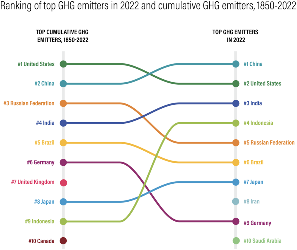
Finally, although it doesn’t emerge from this particular analysis, the funds that poorer, vulnerable nations need should be provided principally in the form of public sector grants from individual nations, the World Bank and development banks, not from loans which simply increase their debt burden, and not from private investments which lead to the nation’s wealth being exported.
The non-history of successful energy transitions
Stripped back to basics, efforts to avoid catastrophic global warming are based on one goal and one strategy. The goal is to eliminate GHG emissions as soon as possible. The strategy is to replace the world’s fossil fuel-based society with one fuelled by renewable energy.
For the optimists, the falling price and accelerating roll out of wind, solar, batteries and pumped hydro provides confidence that the strategy will deliver the goal. The Pollyannas provide examples of successful past and current energy transitions, for instance the UK’s exit from coal-powered power stations, and the slow but steady migration of transport systems from coal and petroleum products to electricity.
But what if the successful energy transitions have been limited to particular places and/or particular sectors of the economy? What if history provides no examples of a successful global energy transition and the examples often quoted provide a misleadingly cheery picture of the challenges ahead? These are the questions tackled by Adam Tooze in a review of two books that constitute “a double-barrelled blast against conventional optimism on “the energy transition”.
The main evidence against a historically-justified inevitability to the much sought after energy transition can be gleaned from the graph below of global primary energy consumption by source between 1800 and 2023.
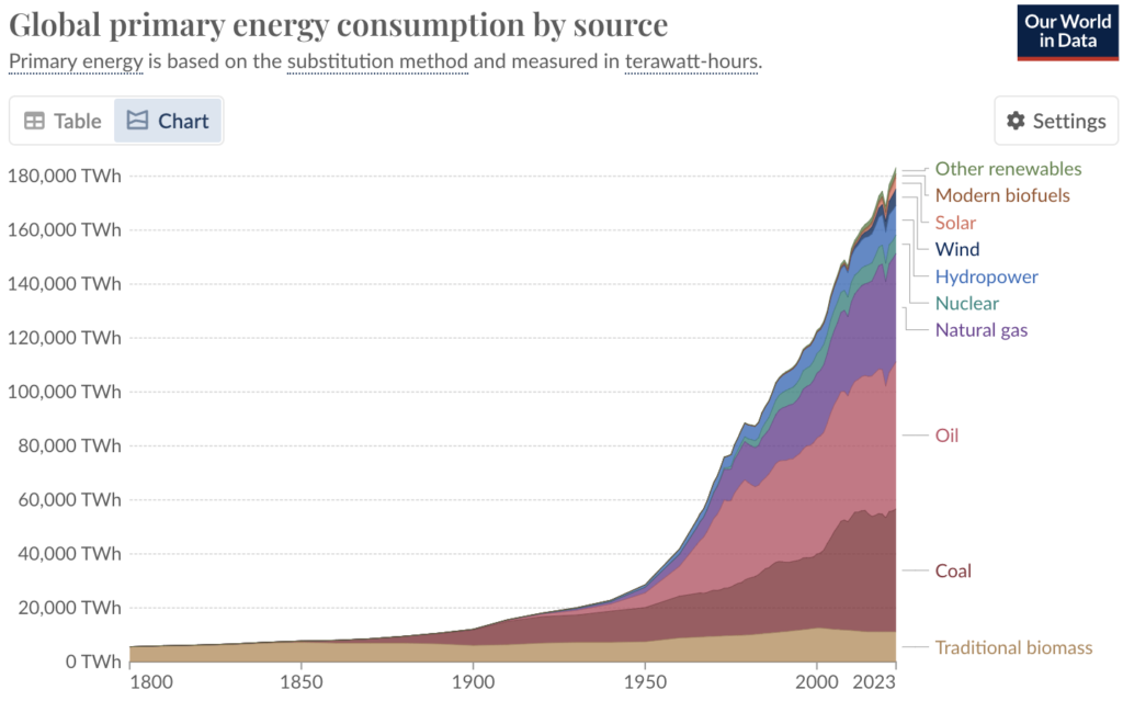
Several new fuels have come along since 1800 but in no case has a new fuel replaced an existing fuel. In every case, consumption of the old fuel(s) has continued to increase when a new fuel has emerged. Even the use of traditional biomass is greater now than in 1800.
In summary, the pattern of consumption when a new fuel has appeared has been one of supplementation, with continued growth rather than diminishing use of the “old” fuel as the new fuel gains acceptance. No transitions can be seen in the graph, only supplementations.
Tooze emphasises that just because something hasn’t happened before doesn’t mean that it won’t ever happen in the future, but he is clear that if the green transition does occur it will be “utterly radical”.
Owlympic Games
Which are the heaviest (4kg), lightest (40gm), tallest (84cm), smallest (13cm), and most widespread species of owl globally? Which one nests in burrows, catches fish, has the longest ear tufts (not really ears at all, by the way)? All is revealed in this 7 minute video.


